HubSpot A/B Testing: How to Optimise Your Website
HubSpot A/B Testing lets your prospects and customers help you design better websites and landing pages by using their engagement to drive changes.
HubSpot Landing Pages: A-Z Guide on using HubSpot Landing pages to get a better ROI for your company.
As online marketing continues to grow, landing pages have become an increasingly important tool for businesses looking to capture leads, increase conversions, and grow their customer base.
HubSpot is a popular inbound marketing and sales software platform that offers a suite of tools for businesses to attract, engage, and delight customers. One of the key features of HubSpot is its landing page builder, which allows businesses to create custom landing pages quickly and easily without the need for any coding knowledge.
In this blog post, we'll dive into the world of HubSpot landing pages and explore the key features and benefits they offer to businesses. We'll discuss the different types of landing pages you can create with HubSpot, the elements that make a landing page effective, and some best practices to follow when creating your landing pages. Whether you're new to landing pages or looking to optimize your existing strategy, this post will provide you with everything you need to know about using HubSpot landing pages to drive results for your business.
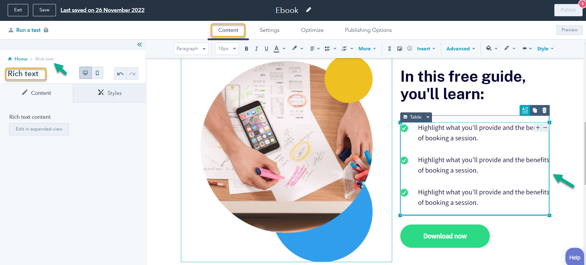
A HubSpot landing page is a standalone web page created using the HubSpot platform that is specifically designed to guide visitors towards a specific action or conversion goal. Unlike a traditional website page, which may have multiple goals or distractions, a landing page is focused on one particular goal, such as filling out a form, downloading an eBook, or making a purchase.
HubSpot landing pages are often used in conjunction with forms and call to action to encourage visitors to take a specific action, such as signing up for a newsletter or downloading a whitepaper.
A HubSpot landing page is designed to capture leads from a specific marketing campaign or advertising effort. It is not connected to your website's main navigation, and it typically has a specific goal, such as collecting email addresses or promoting a particular product.
They are typically used to capture leads or drive conversions, and they usually have one call-to-action (CTA) that is highly visible and relevant to the user.
HubSpot landing pages are typically used in conjunction with marketing campaigns, such as email marketing or paid advertising, to drive traffic to the page and encourage visitors to take a specific action. HubSpot also provides analytics tools that allow you to track the performance of your landing pages, such as the number of visitors, conversion rates, and bounce rates. This data can be used to optimize your landing pages over time and improve your overall marketing strategy.
HubSpot landing pages are created using a drag-and-drop editor, which means you don't need to have any coding knowledge to create a professional-looking landing page. HubSpot provides a range of pre-built templates that you can customize to match your brand and messaging. You can also add various elements to your landing pages, such as images, videos, forms, and calls-to-action (CTAs), to optimize the page for conversions.
Why Use HubSpot Landing Pages?
There are many reasons why you should be using landing pages as part of your marketing strategy.
Some of the key reasons why you might want to use HubSpot landing pages include:
Capture More Leads:
Landing pages are an effective way to capture leads by offering something of value (such as an eBook or a whitepaper) in exchange for a visitor's contact information. A lead is simply someone who has shown an interest in your product or service by providing their contact information.
Promote specific products or services:
You can use landing pages to promote a specific product or service and provide more detailed information about the offering to help convince visitors to make a purchase.
Drive more conversions:
The main purpose of a landing page is to get the user to take action, so it's important that the CTA is relevant and visible. So, landing pages are designed to focus the visitor's attention on a specific call-to-action, such as signing up for a newsletter or making a purchase. This helps to increase the chances of conversion. Landing pages are also an excellent way to drive conversions. A conversion is defined as a goal that a visitor completes on your website, such as subscribing to your newsletter, downloading a white paper, or making a purchase.
Track and analyse results:
HubSpot provides tools to help you track and analyse the performance of your landing pages, so you can see how well they are performing and make improvements as needed.
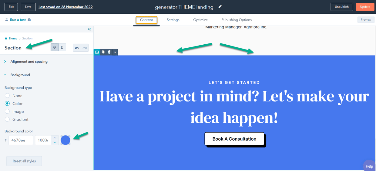
Tips for Creating Landing Pages
Here are some tips for creating landing pages with HubSpot.
Define a Single Clear Goal:
Before you start creating your landing page, it's important to define a clear goal for the page. Defining a clear goal for your landing page is crucial because it helps you focus the page on a specific objective and make it more effective. This could be something like collecting email addresses, promoting a specific product, or driving registrations for an event. Having a clear goal will help you focus your page and make it more effective. Without a clear goal, your page may lack direction and may not be as effective at converting visitors.
Some examples of goals for a landing page might include:
Having a clear goal will help you focus your page and make it more effective by ensuring that all of the elements of the page, such as the copy, the images, and the calls to action, are aligned with that goal.
It will also make it easier for you to track and measure the success of your page, as you will be able to see how well it is achieving the specific objective you have set.
Keep things simple:
The best HubSpot landing pages are those that are simple and easy to understand. Visitors should be able to quickly see what your page is about and why they should take the desired action. To keep your page simple, follow these tips:
Use forms and calls-to-action effectively:
HubSpot Forms and calls-to-action (CTAs) are crucial elements of a landing page, as they are what encourage visitors to take the desired action. Make sure your forms are short and easy to fill out, and use strong, actionable language for your CTAs.
Forms and calls-to-action (CTAs) are key elements of a landing page because they are what encourage visitors to take the desired action. Forms are used to collect information from visitors, such as their name and email address, while CTAs are buttons or links that prompt the visitor to take a specific action, such as signing up for a newsletter or making a purchase.
To use forms and CTAs effectively on your landing page, there are a few key things to keep in mind:
Keep forms short and easy to fill out:
Long forms can be intimidating and may discourage visitors from completing them. To maximise conversions, make sure your forms are as short as possible and only ask for the information you really need.
Use strong, actionable language for your CTAs:
The language you use for your CTAs should be strong and actionable, and it should clearly communicate the value of the offer. For example, instead of saying "Learn more," you might say "Get your free eBook now."
Make your CTAs stand out:
Your CTAs should be prominent and easy to see on the page, so that visitors don't miss them. Use contrasting colours and make sure they are placed in a location where they are easy to find.
Test and optimise:
Once your landing page is live, it's important to track its performance and make improvements as needed. Use HubSpot's analytics and A/B testing tools to see how well your page is performing and identify areas for improvement.
Once your landing page is live, it's important to track its performance and make improvements as needed in order to maximise conversions. There are a few key tools and techniques you can use to do this:
Use HubSpot's analytics:
HubSpot provides a range of analytics tools that can help you track the performance of your landing page. You can see how many visitors are coming to the page, how long they are staying, and what actions they are taking. This will help you identify areas where your page is performing well and areas that may need improvement.
A/B test different versions of your page:
A/B testing, also known as split testing, is a way to compare two versions of a page to see which one performs better. You can use HubSpot's A/B testing tools to create two versions of your landing page and test them against each other to see which one performs better. This can help you identify the most effective elements of your page and make informed decisions about how to optimise it.
Make changes based on data observations and ongoing testing:
Once you have analysed the performance of your landing page and identified areas for improvement, you can make changes to the page to try to increase conversions. This might include changing the headline, adding social proof, or adjusting the layout.
By testing and optimising your landing page, you can continually improve its performance and maximise conversions.
Use Testimonials And Customer Stories
Customers want reassurance that they are making a good decision before they take action on your HubSpot landing page—and one of the best ways to provide that reassurance is by featuring testimonials from satisfied customers on your page. If you do not have any testimonials yet, you can also feature stories from happy customers who have used your product or service to benefit from its positive results first-hand."
Use social proof:
Social proof is the idea that people are more likely to take a desired action if they see that others are doing it. You can use social proof on your landing page by including customer testimonials, social media followers or likes, or media mentions.
Keep your branding consistent:
Make sure your landing page is consistent with your overall branding and messaging. Use the same colours, fonts, and style as your website to create a cohesive experience for visitors.
Make it easy to share:
If you want to encourage visitors to share your landing page with their friends and colleagues, make it easy for them to do so by including social sharing buttons.
Keep the page load time fast:
Visitors are less likely to stick around if your page takes too long to load, so make sure to optimise your page for fast load times.
Use clear and concise language:
Avoid using jargon or overly complex language on your landing page. Keep it simple and easy to understand, and focus on the benefits of your offer
Use Relevant Keywords
If you want the landing page to rank in Google like your other pages, one of the most important things you can do to optimise your HubSpot landing page is to use relevant keywords. Keywords are the words and phrases that people use when they search for information online. By including relevant keywords on your landing page, you can improve your chances of being found by prospective customers who are looking for what you have to offer.
When choosing keywords, be sure to select those that are relevant to your products or services and that have a high search volume. You can use tools like Google Ads Keyword Planner and semrush.com to research potential keywords. Once you have selected your keywords, be sure to include them in the title, headline, and body copy of your landing page.
Optimise for Mobile:By following these tips, you can create effective HubSpot landing pages that help you achieve your marketing goals.
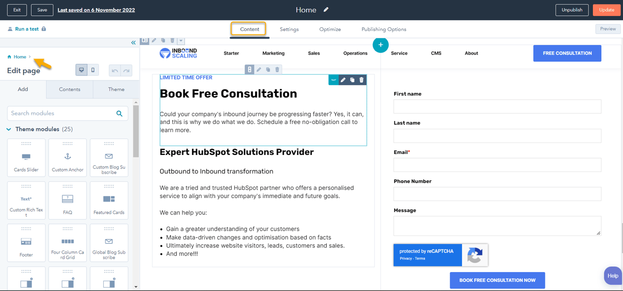
A strong call-to-action (CTA) is one of the most important elements of an effective HubSpot landing page. Your CTA should be impossible to miss and encourage visitors to take immediate action. Learn more about HubSpot CTA's
There are several ways you can make your call-to-action (CTA) more effective on your landing page. These include:
Making it "clickable" by using colour or underlining the text:
Using a different colour or underlining the text of your CTA can help it stand out and make it more noticeable to visitors.
Using persuasive language such as "free" or "now":
Words like "free" and "now" can be effective at persuading visitors to take action because they highlight the value of the offer and create a sense of urgency.
Creating a sense of urgency with phrases like "limited time only":
Phrases like "limited time only" can help create a sense of urgency and encourage visitors to act quickly before the offer expires.
Personalising the CTA by using the visitor's name:
This approach can make the offer feel more tailored and relevant to them, which can increase the chances that they will take action.
Offering a freebie or discount in exchange for taking action:
This approach can be a powerful motivator for visitors, as it provides an additional incentive to take the desired action.
By using these techniques, you can make your CTAs more effective and increase the chances of converting visitors on your landing page.
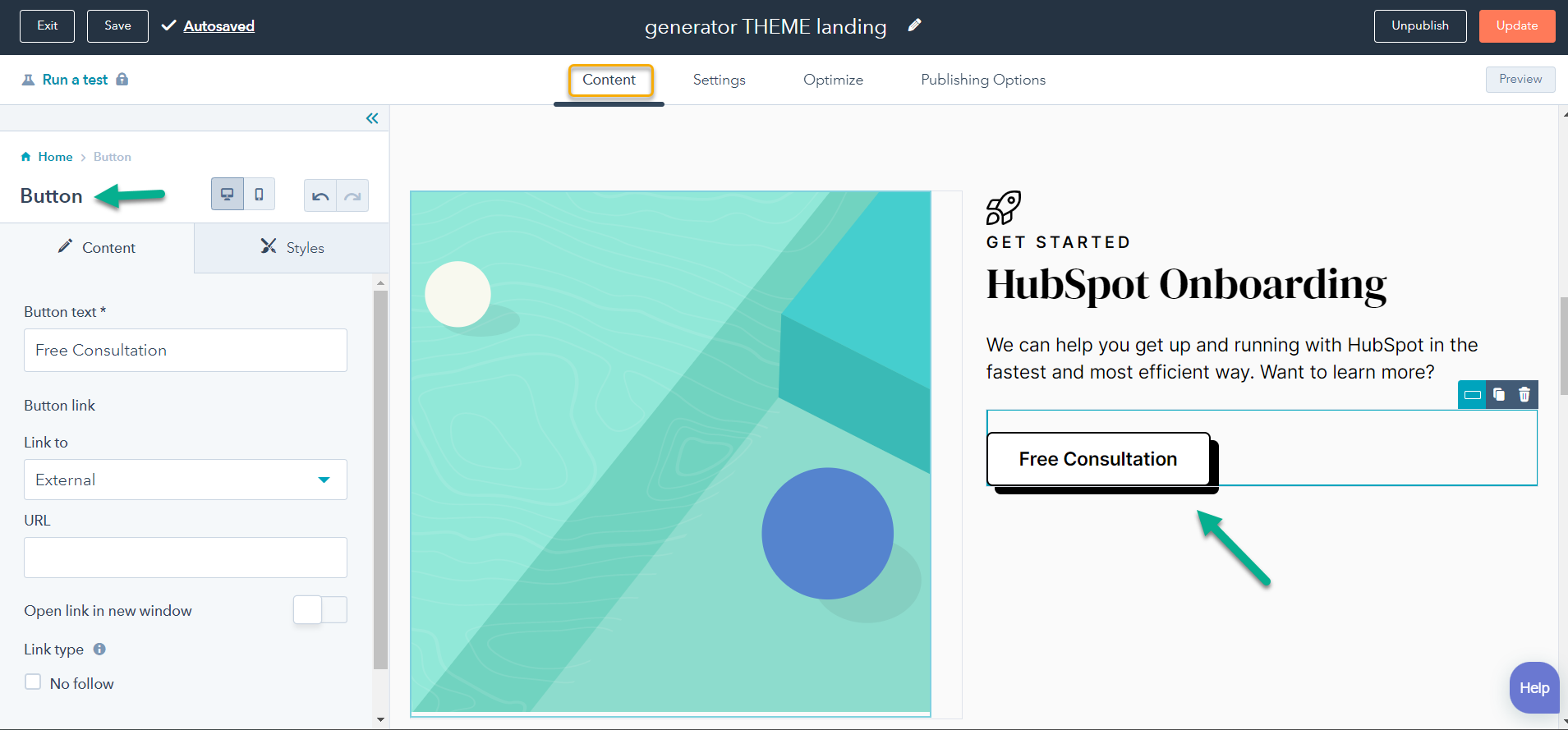
Steps for Creating a New Landing Page
No matter what type of HubSpot landing page you want to create, the process is always the same. In this article, we'll walk you through the steps you need to take to create a high-converting HubSpot landing page. To create a HubSpot landing page, follow these steps.
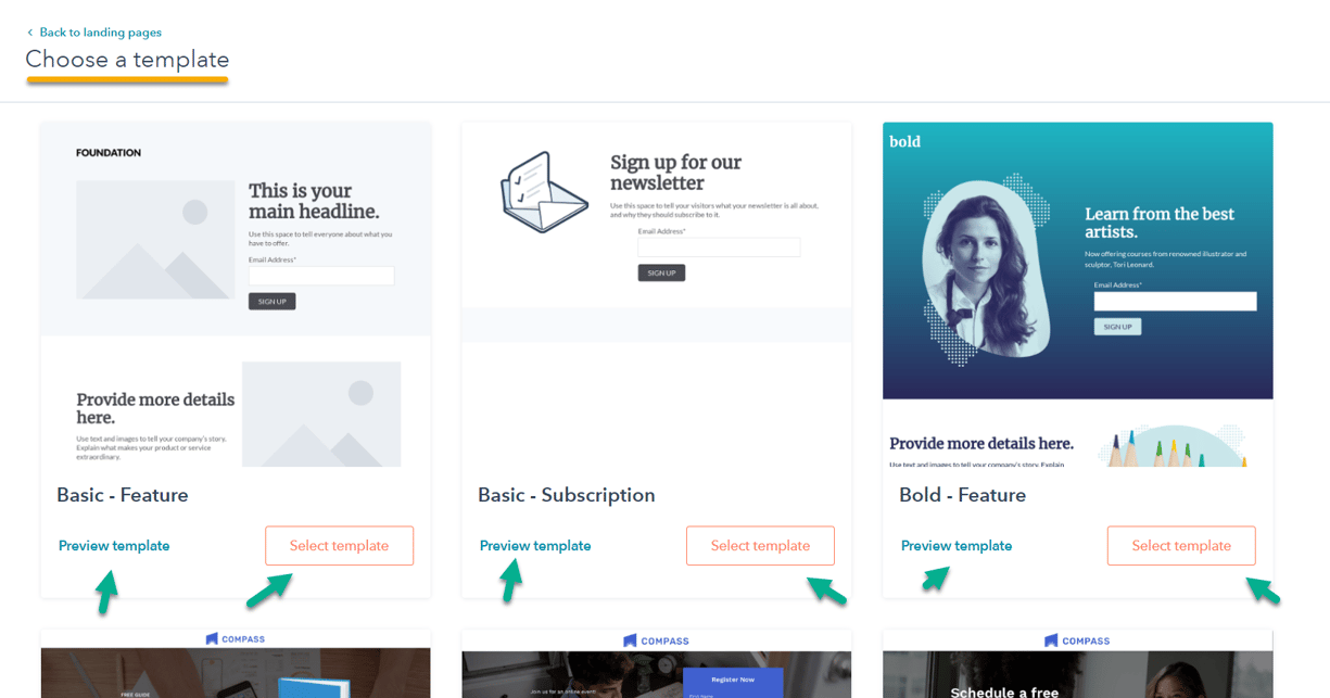
Choose a template:
Now that you know what type of HubSpot landing page you want to create, it's time to pick a template. HubSpot offers a range of templates for different types of pages, so there's sure to be one that's perfect for your needs. You'll then be prompted to choose a template for your new landing page. There are dozens of templates available, so take some time to browse through them and find the one that best suits your needs. Once you've found a template you like, click on the "Use this template" button. HubSpot offers a range of templates that you can use to create your landing page. Select a template that is appropriate for your goals and the content you want to include on the page.
Customise the content:
Use the drag-and-drop editor to customise the content of your landing page. Then start adding content using the various modules (also known as widgets) that are available.
You can add text blocks, images, forms, CTAs, social sharing buttons, videos, and other elements to the page as needed. Continue adding content until your page looks the way you want it to.
Add a form:
To collect information from visitors, you will need to add a form to your landing page. Use the drag-and-drop editor to add a form and customise the fields that you want to include.
Add a call to action:
A call-to-action (CTA) is a button or link that prompts visitors to take a specific action, such as signing up for a newsletter or making a purchase. Use the drag-and-drop editor to add a CTA to your landing page and customise the text and appearance of the button.
Publish the page:
Once you have finished customising your landing page, click the "Publish" button to make it live.
By following these steps, you can create a landing page using the HubSpot platform
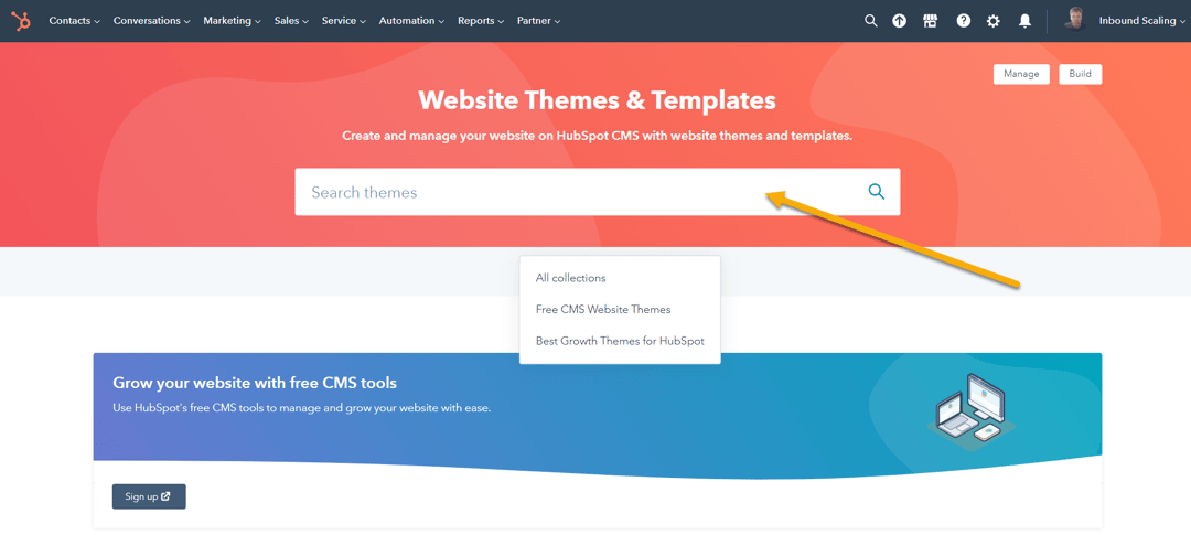
HubSpot Marketplace
The HubSpot Marketplace is an online platform where you can find and purchase third-party tools and integrations that work with the HubSpot software. The Marketplace offers a wide range of tools and integrations, including sales, marketing, and customer service tools, as well as integrations with other software platforms.
To create a landing page using the HubSpot Marketplace, follow these steps:
By using the HubSpot Marketplace, you can access a wide range of landing page templates that you can customise to meet your needs. This can save you time and make it easier to create professional-quality landing pages.
Conclusion:
Creating an effective landing page can help you generate leads and drive conversions for your business, but only if it is properly optimised. Using HubSpot's easy-to-use landing page builder, anyone can create beautiful, high-performing pages in no time flat.
A HubSpot landing page is a standalone web page designed to capture leads from a specific marketing campaign or advertising effort. It is typically used in conjunction with forms and calls to action to encourage visitors to take a specific action, such as signing up for a newsletter or downloading a whitepaper. HubSpot provides tools to create and edit landing pages, as well as track and analyse their performance.
Tips for creating effective HubSpot landing pages include defining a clear goal, keeping the page simple, using compelling headlines and subheadings, using high-quality images and graphics, optimising for mobile, using forms and calls-to-action effectively, and testing and optimising the page.
To create a HubSpot landing page, you can use the drag-and-drop editor to customise the content of the page, add a form to collect information from visitors, add a call-to-action, and publish the page. Alternatively, you can use the HubSpot Marketplace to access a range of landing page templates and customise them to meet your needs.
Creating a high-converting HubSpot landing page is easy if you follow the steps outlined above. Just remember to choose your goal first, then select a template and design your page accordingly. So what are you waiting for? Start building those landing pages today!
If you want to learn more about HubSpot Marketing, see our guide to HubSpot Marketing Hub
HubSpot A/B Testing lets your prospects and customers help you design better websites and landing pages by using their engagement to drive changes.
A landing page is a specific web page that is designed for lead generation and conversion. They can be tested against website pages or other landing...
Enhance lead generation with HubSpot Forms - a comprehensive guide on using forms to capture, manage, and nurture leads effectively on your website.
Be the first to know about new HubSpot nsights to build or refine your business with the tools and knowledge of today’s best practises.